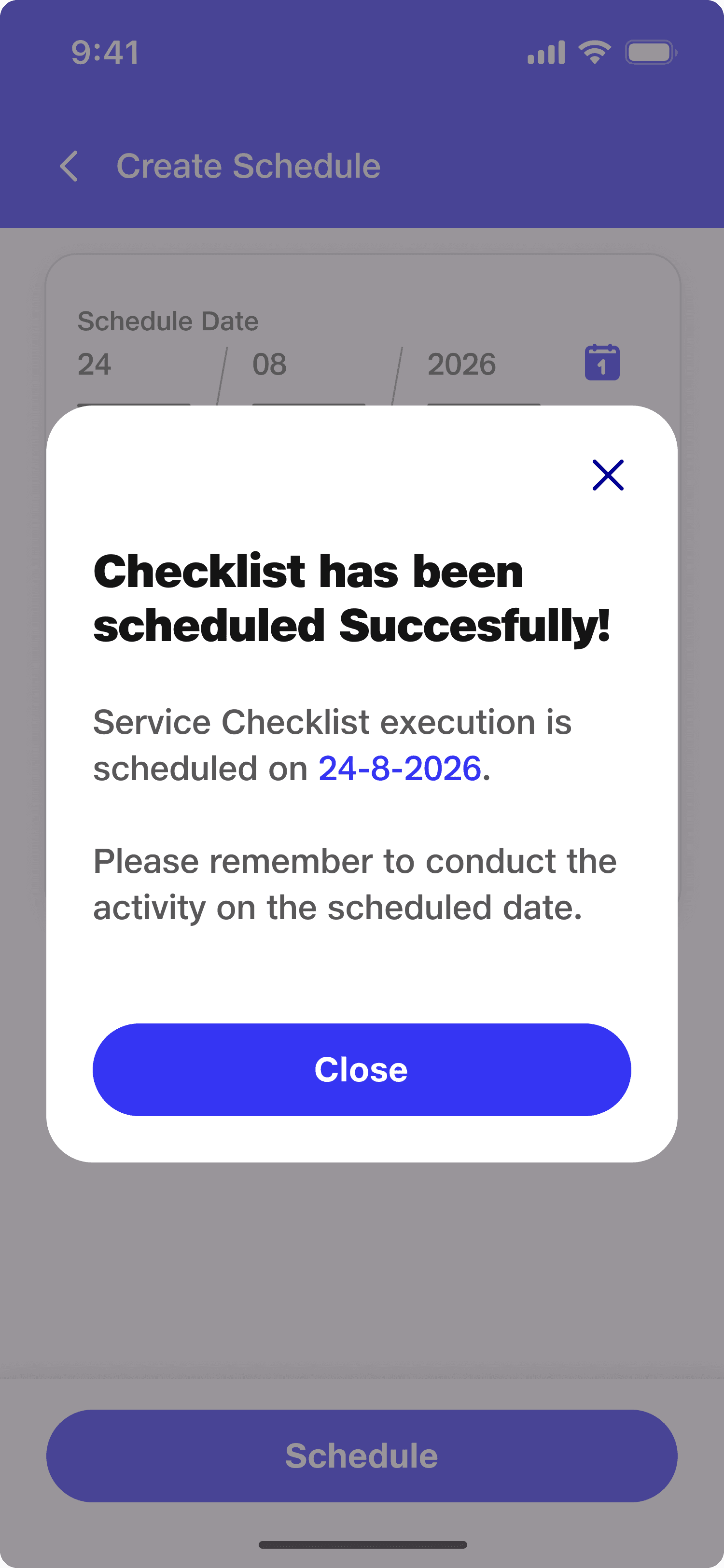
This Web-on-Mobile application is an enterprise-grade, configurable checklist management ecosystem designed to streamline health, safety, and operational compliance audits across complex organizational hierarchies
If a field worker was in the middle of a massive checklist and received a phone call, the native app would crash instantly wiping out all their unsaved work.
If a bug broke the app on-site, our hands were tied by 1-to-2 week App Store and Play Store review cycles before we could ship a fix.
The app forced workers down a strict, linear path (Question 1, Question 2, Question 3...). But kitchens don't work in a straight line. If a worker was standing by the stove, they couldn't easily skip a "food storage freezer" question without getting blocked.
By bypassing the app stores, we could ship critical bug fixes instantly. We cut deployment timelines down to under 24 hours.
The "call-crashing" issue disappeared, giving field workers a reliable tool that didn't erase their progress mid-shift.
I spent time on the ground shadowing our Service Executives inside busy commercial kitchens. I watched them struggle with the old app's rigid order because every food court layout is completely different.
The Fix: I designed Facility Area Cards (like Food Prep, Cold Storage, and Dining Hall).
How it works: Instead of a never-ending list, the worker is greeted by a dashboard of physical "Zones". They can walk into a room, tap that specific zone, and answer the questions that match what they are physically looking at. Clear progress bars (e.g., "5/5 answered") and urgency badges keep them on track without forcing their hand.
Setting up and updating checklists for hundreds of individual food courts is usually an administrative mess. To fix this, I designed a 4-layer setup tree:
Organization -> Location -> Building -> Food Court
We built a "cascade" feature. If an admin maps a standard checklist to "Location A," the system automatically rolls it out to every building and kitchen sitting under that location. This saved the admin team hours of tedious manual data entry.
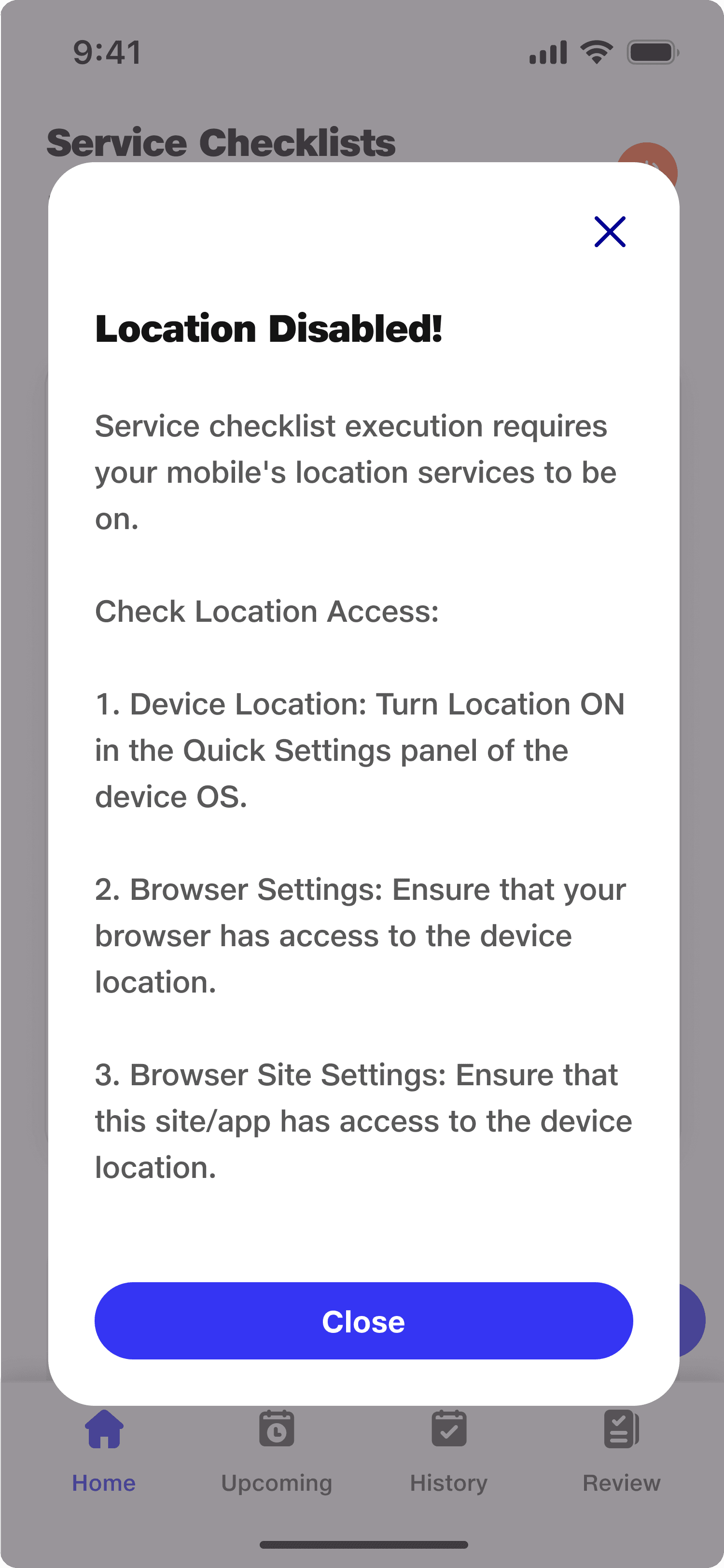
Stakeholders initially wanted the app to verify the user's location on every single question to prevent cheating. However, enterprise kitchens are often in basements or steel structures with terrible cell service. Checking location constantly would introduce lag and break the app.
The Compromise: We built an 800-meter geo-fence check that triggers strictly at two points: when you Start the audit and when you Submit it. This protected data integrity without making the app painful to use in a dead zone.
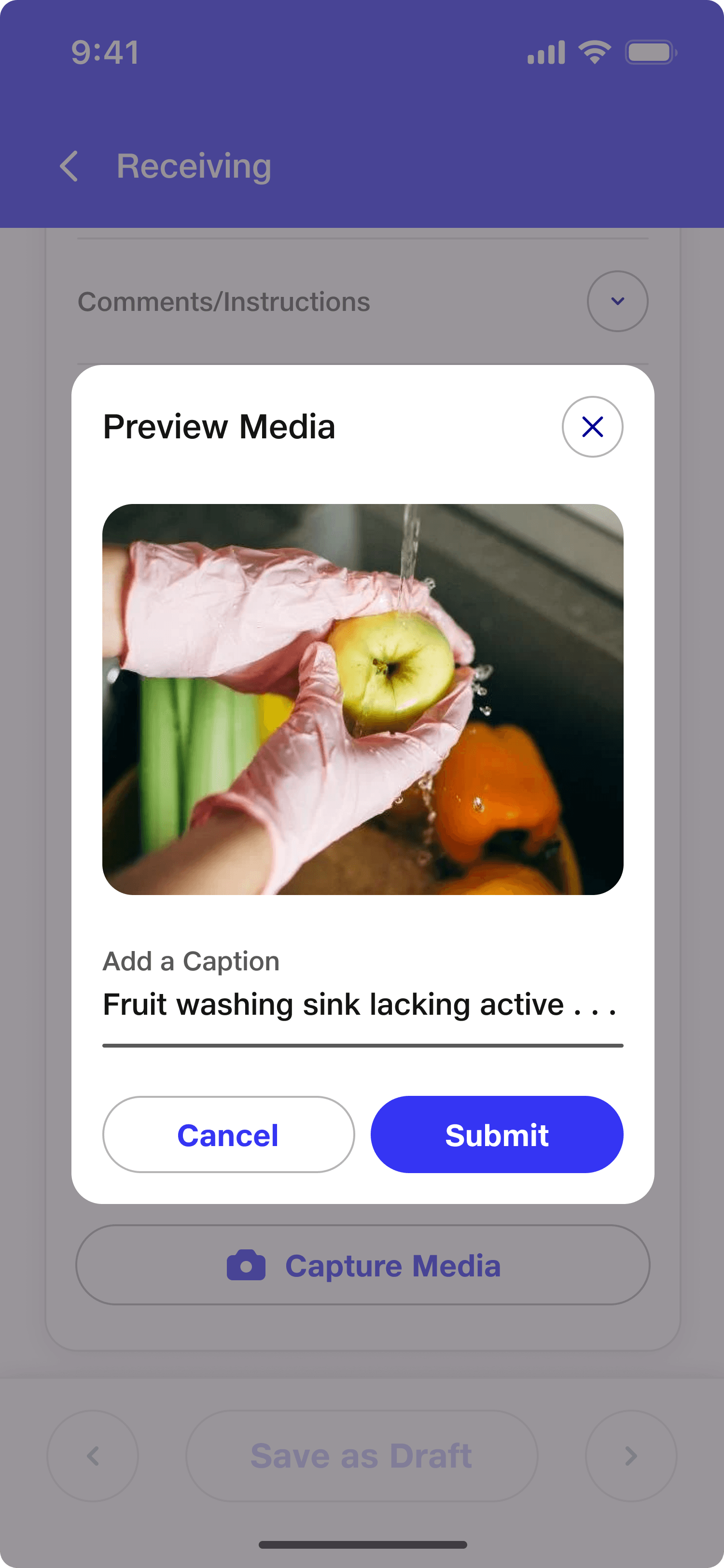
Instead of making workers fill out endless comments and attach photos for things that are perfectly fine, we created a dynamic "Criticality X Response" matrix. The app adapts based on how severe a failure is.
If a worker checks a Vital item (like an active health hazard) and marks it Poor or Not Working, the form instantly expands.
The app locks the "Next" action until they take a mandatory photo and type out specific remarks.
If the item is marked "Good," the extra fields vanish to save them time.
Kitchens are fast-paced and chaotic, so the app had to be highly tactile and instantly readable. By building everything strictly with the Jio Design System (JDS), we gained a massive advantage: our users already used internal JDS apps (like the HR platform), which completely erased the learning curve.
Our core production screens highlight how we used JDS parameters to create a seamless mobile workflow:
We used the primary blue (
#3535F3) for high accessibility contrast. As seen in Question Assessment (Mandatory Fields Triggered), when an item is marked "Poor," bold warning colours instantly grab attention under harsh kitchen lights.
Layouts utilized standard spacing tokens and interactive components. To ensure easy interaction on the move, buttons and cards applied a generous 16px border radius to provide comfortable, finger-friendly touch targets.
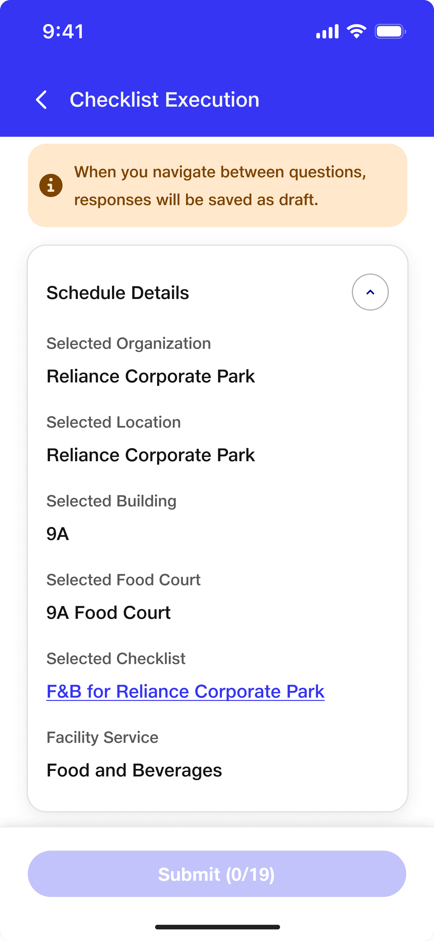
We fully adopted the JioType font family. As shown in Checklist Execution (Expanded Schedule View), bold values and sharp text hierarchy eliminate eye strain on small mobile screens.
To save valuable screen space, we used accordion components. Comparing Checklist Execution (Closed Schedule View) to Checklist Execution (Expanded Schedule View) shows how bulky site metadata neatly tucks away so users can focus entirely on the audit questions.
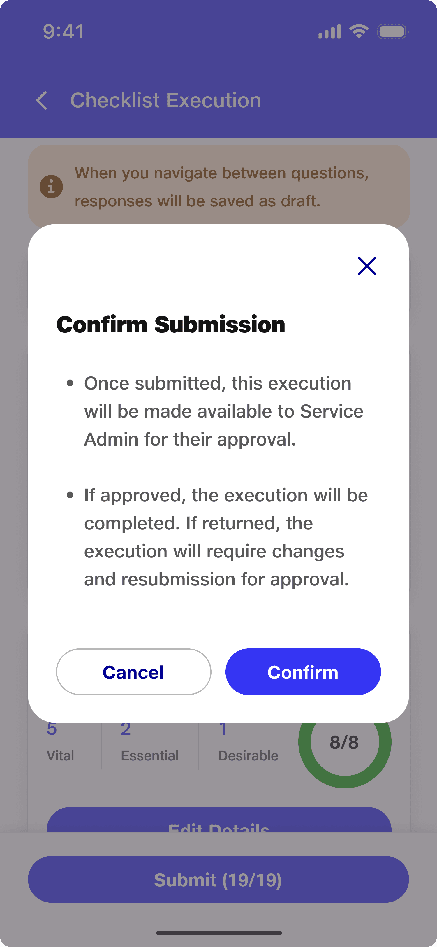
To give executives quick validation, each zone card features a circular progress tracker. As seen in Checklist Execution (All Areas Completed State), it clicks into a solid green ring the exact moment a section is done.
The underlying architecture was built so flexibly that we didn't have to redesign a thing to scale out. The platform now seamlessly runs Facility Health Management and Construction Site Tracking checklists with few code changes.
By forcing photo proof for high-criticality failures, we removed all guesswork and arguments from the admin review process.
The second an audit wraps up, it automatically compiles everything from GPS stamps and timestamps to photos and remarks into a clean, shareable compliance report for leadership.
Note: To keep this case study short and easy to read, I have left out the heavy workflows, such as:
For Platform Admins: The setup dashboards where admins create checklists, build food court masters, map locations, and configure geo-fencing settings.
For Service Admins and Executives: The manager approval steps, rescheduling, tracking old submissions, and viewing final compliance reports.